You only get one chance to make a first impression. For you as an event planner, this means your event website should roll out a virtual red carpet, ready to captivate your potential attendees and give them a glimpse of your event. A great event website is not just a source of information; it’s the face of your event.
Download our e-book to discover how to achieve this and how a well-crafted event website design can elevate your event to new heights.
What is an Event Website?
An event website is an online platform designed to provide information about a specific event. The purpose of such a website is to inform potential attendees, sponsors, and other interested parties about details like date, time, location, speakers, agenda, registration instructions, and other relevant event information.
Typically, an event website includes the following elements:
- Event Details: Includes event name, date, time and location.
- Agenda: A detailed overview of what will happen at the event, including speakers, workshops, and other activities.
- Registration: Information and links for attendee registration, including any costs and deadlines.
- Speakers and Participants: A list of individuals involved in the event, such as speakers, panelists, or special guests.
- Sponsor Information: Details about companies or organizations sponsoring the event.
- Contact information: Details on how interested parties can get in touch with the event organizers.
Event websites are commonly used for conferences, trade shows, festivals, webinars, and various types of gatherings. They serve as a central hub for disseminating information and facilitating communication surrounding the event. Additionally, they are where you not only share essential details but also convey the ambiance and unique essence of your event. Essentially, it’s the digital gateway to your event experience.
5 Tips for Visually Appealing Design
A picture is worth a thousand words – this holds true for your event website too. Did you know that users take just a fraction of a second to form an impression of a website? Within 2.6 seconds, the company logo already plays a central role in this initial impression. Source: Gould, R. (2023, October 17). Website Design: The Importance of First Impressions. Userbrain Blog.
Visual appeal is crucial as it keeps visitors engaged. By using appealing images that embody your event theme and a layout that is intuitive on any device, you have full control over your visitors’ attention span.
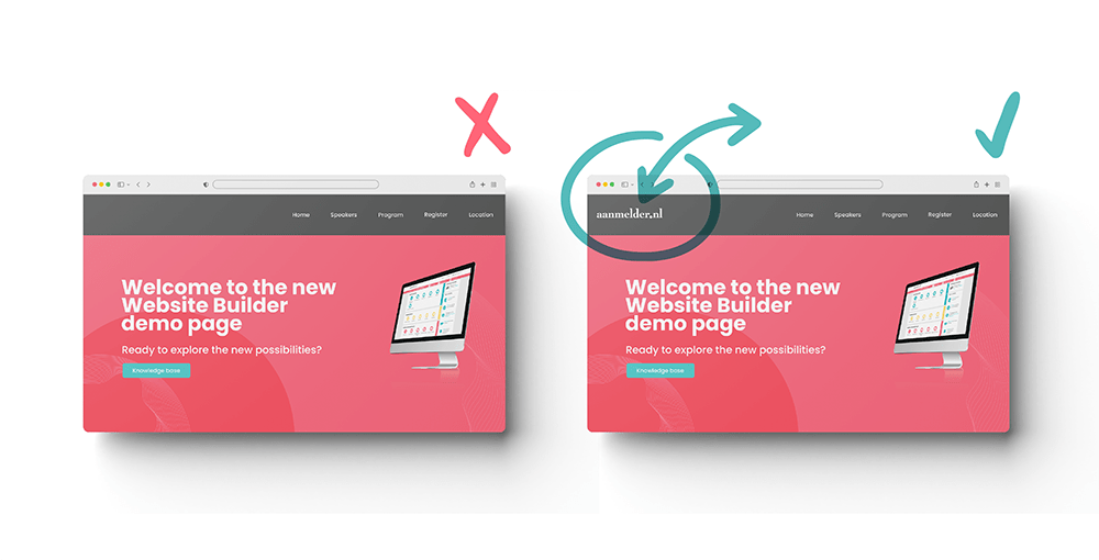
Discover these 5 design tips to create a powerful and consistent look for your event website: a strong visual identity, thoughtful use of color, appropriate typography, strategic logo placement, and eye-catching visuals and graphic elements!

Mobile Accessibility
Remember, many of your visitors will use their phones to discover your event. A website accessible on mobile devices is often referred to as having a responsive design. This is vital as 55% of global online visits come from mobile, 43% from desktop, and 2% from tablets. Experts predicted that mobile internet would eventually surpass desktop, and it seems they were right. Source: Kinsta. (2023, October 2). Market Share and Usage Statistics for Mobile vs Desktop. Kinsta®.
A website that doesn’t scale to different screen sizes is like a half-opened door: it’s disruptive and reduces accessibility. Ensure a responsive design that adapts to smartphones, tablets, and desktops, ready to impress wherever your guests are. Discover Mobile Accessibility in our e-book!
Interactive Elements
An event is vibrant and dynamic – and your event website should reflect that lively energy. Interactive elements like countdown timers, videos, gallery widgets, map widgets, or live updates on attendance numbers create a sense of now. But how do you implement this on your event website? Check out tips on interactive elements here!
Did you know that the website builder at aanmelder.nl not only includes the handy program widget but also seamlessly integrates with registration forms, automated and personalized mailings, ticketing, financial administration, and more? Discover the versatility of our tools and make planning your event as simple and efficient as possible!
The Importance of Call-to-Action Buttons for Event Websites
An effective event website starts with the first click. As an event planner, creating a website that attracts participants, engages them, and prompts them to take action is a vital part of your overall success strategy. The power of so-called ‘call-to-action’ (CTA) buttons is often overlooked. These small yet crucial links in web design make the difference between a page visit and a registration.
Which call-to-action button appeals to you more?
- Discover how to make the most of CTAs here!
- “Click here.”
Informational Content:
Imagine an event you’ve attended in the past. What made it worth attending for you? It was probably not just the speakers or the venue but also how everything was communicated. It’s crucial to get people excited and keep them engaged with your event, starting from the first point of contact.
When building a website for your event, the content you share is as important as the event itself. It should be clear, engaging, and contain all the key information. Let’s delve into the elements that contribute to an event page that not only attracts your participants but also retains and inspires them. Explore the world of informative content in the e-book!
Navigation
In the digital world, where visitors act as explorers on a virtual path, UX tips serve as signposts that make the crucial difference between getting lost and navigating smoothly. To offer you the best support, we asked our own UX Researcher, Lila, to share three signposts that elevate the navigation of your event website to a higher level. Discover the three signposts now in our free e-book!
In this e-book, we unveil the possibilities that a thoughtful web navigation design provides, specifically crafted for event organizers looking to optimize their digital presence.